Introduction
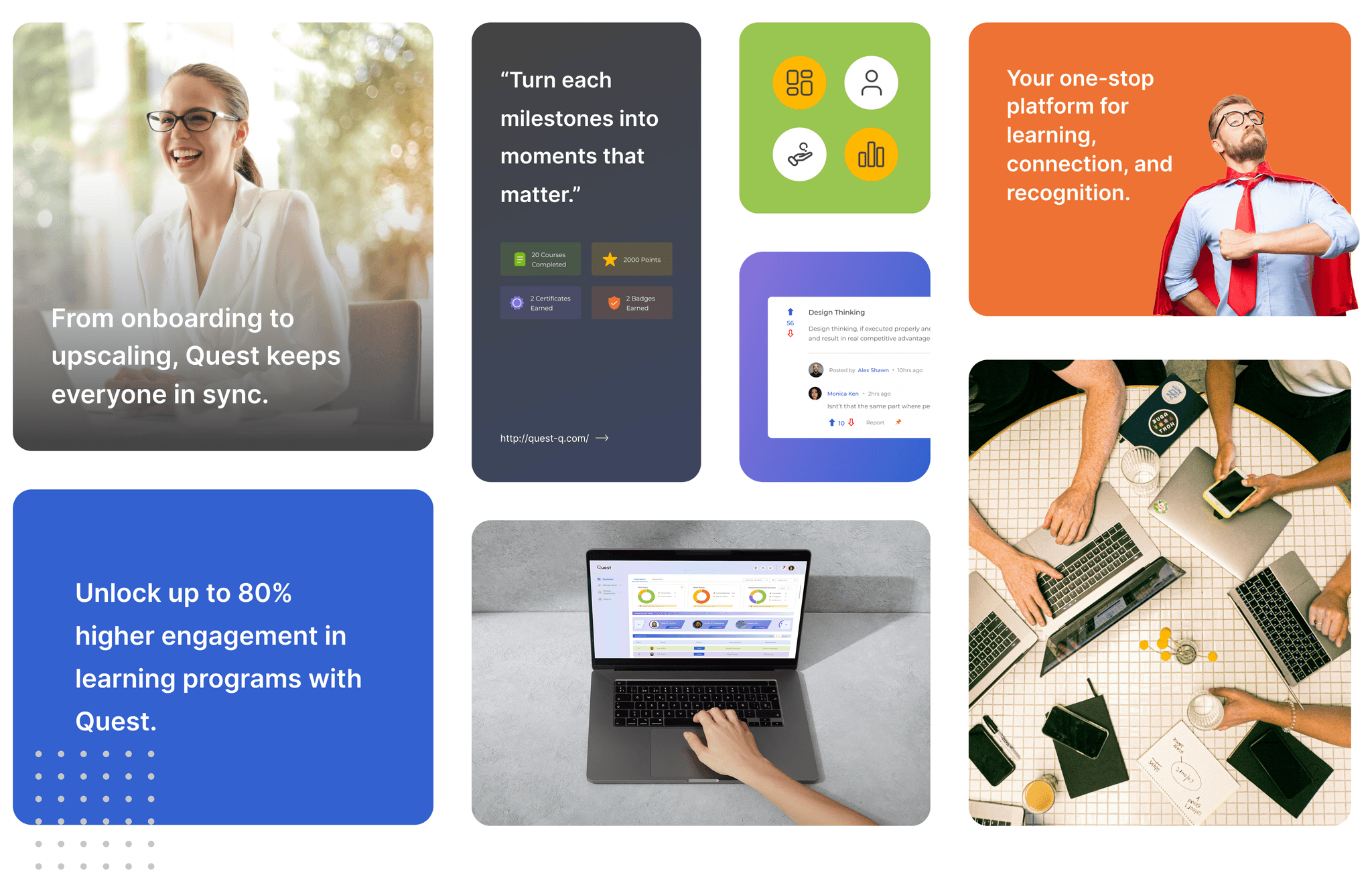
Quest is a powerful all-in-one SaaS platform designed to keep employees, admins, and leaders aligned. It brings updates, feedback, and decisions into one shared space, ensuring nothing slips through the cracks. With Quest, teams gain clarity, stronger collaboration, and full transparency across the board.
It turns everyday tasks into meaningful progress with gamified tasks, team vibes, and a workspace that actually thrives. Work smarter, grow faster, and never miss a ahead.
My Role
At SchbangQ, I was part of the founding design team and led the end-to-end design of Quest, our flagship product. As the sole designer, I was responsible for everything from early-stage brainstorming and defining the user experience to creating high-fidelity wireframes and conducting QA to ensure pixel-perfect implementation. Throughout the process, I collaborated closely with multiple stakeholder.
Product Manager - to define project scope, gather requirements, and co-develop feature ideas, including SEO-focused strategy.
COO - for timely feedback and for strategic UX direction
Engineers - to ensure seamless handoff and precise execution of the design vision.
Other Designers - to delegate and oversee parallel tasks, and make sure that the timelines were met.
Product Case Study
Why Quest?
At Quest, we’re building more than a platform, we’re shaping a culture. Our values guide how we work, grow, and support one another.
Grow With Purpose
Learning isn’t a one-time task, it’s how we move forward. With Quest, every employee has the tools and support to keep growing, one skill at a time.
Build With Others
We’re better when we work together.
The best ideas come when people from different teams, backgrounds, and roles connect. So we stay open, collaborative, and always up to co-create.
Back the Brave
Trying something new takes guts.
We celebrate people who raise their hand, take chances, and give it a go even if it doesn’t work out. Progress > perfection.
Problem Statements
Employees struggle with fragmented tools for engagement, learning, and recognition, resulting in a disjointed growth experience.
Limited visibility into goals, progress, and feedback, especially across hierarchies often leaves employees feeling misaligned and disconnected from the larger vision.
Scattered feedback and outdated LMS systems make continuous learning difficult for employees. And with most companies lacking built-in platforms, employees are often pushed toward external or paid certifications to grow and upskill.
Admins and leaders often lack the tools to effectively manage teams, monitor performance, and design impactful engagement journeys.

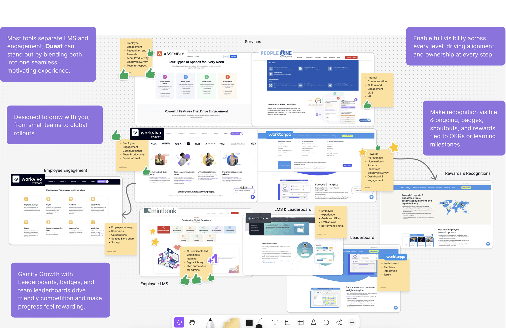
Competitive Analysis
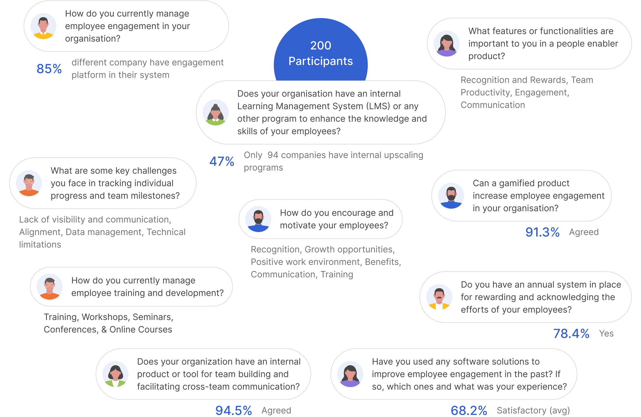
Quantitive Research Result
This study was done to understand how companies approach engagement and growth, and to hear directly from employees about how open they are to getting involved. We surveyed 200 people from different industries and company sizes.


Site-map
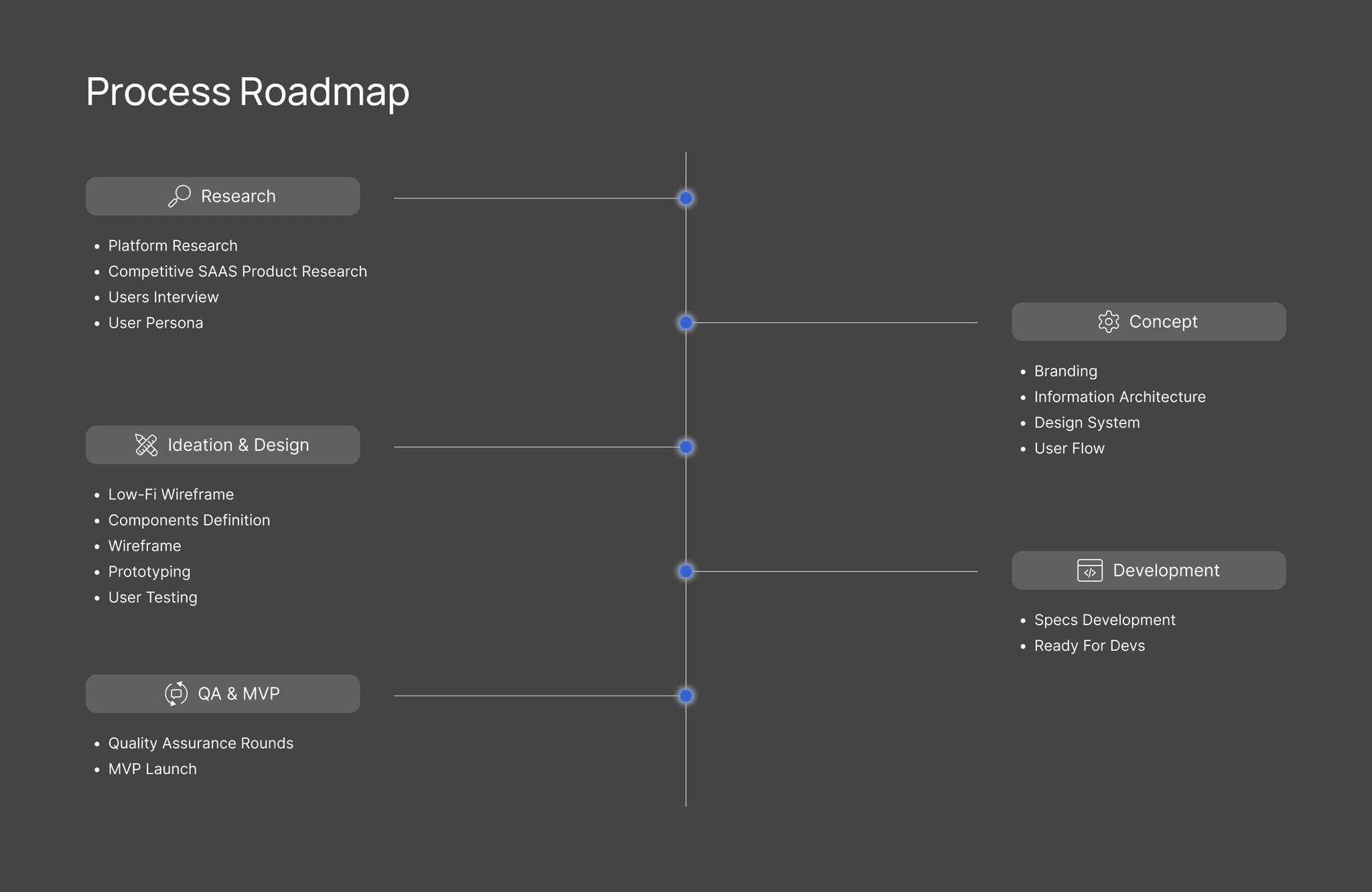
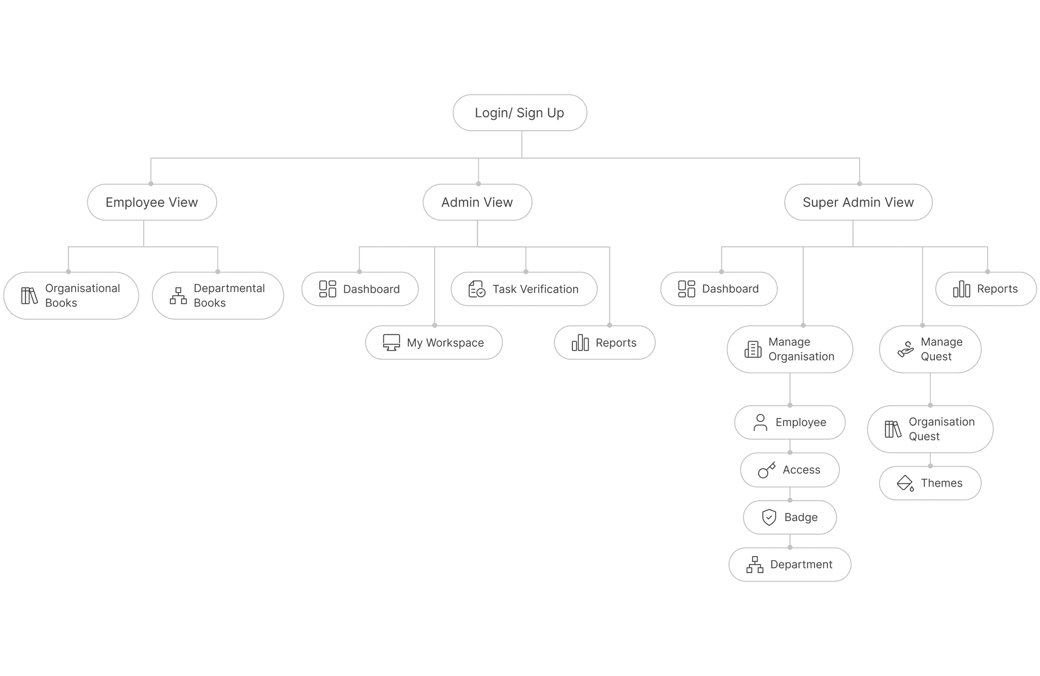
A visual overview of Quest’s architecture, mapping out the hierarchy and connections between key pages and screens.
Wireframes
Final Designs
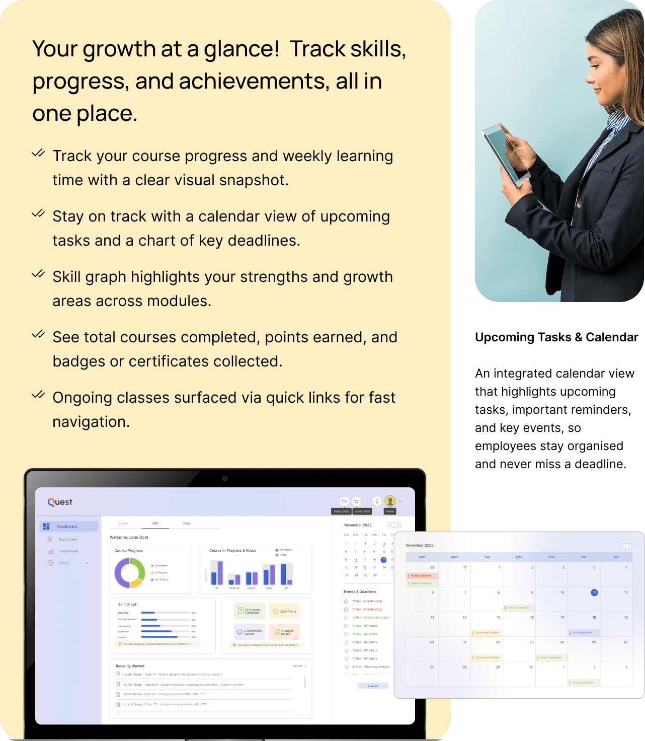
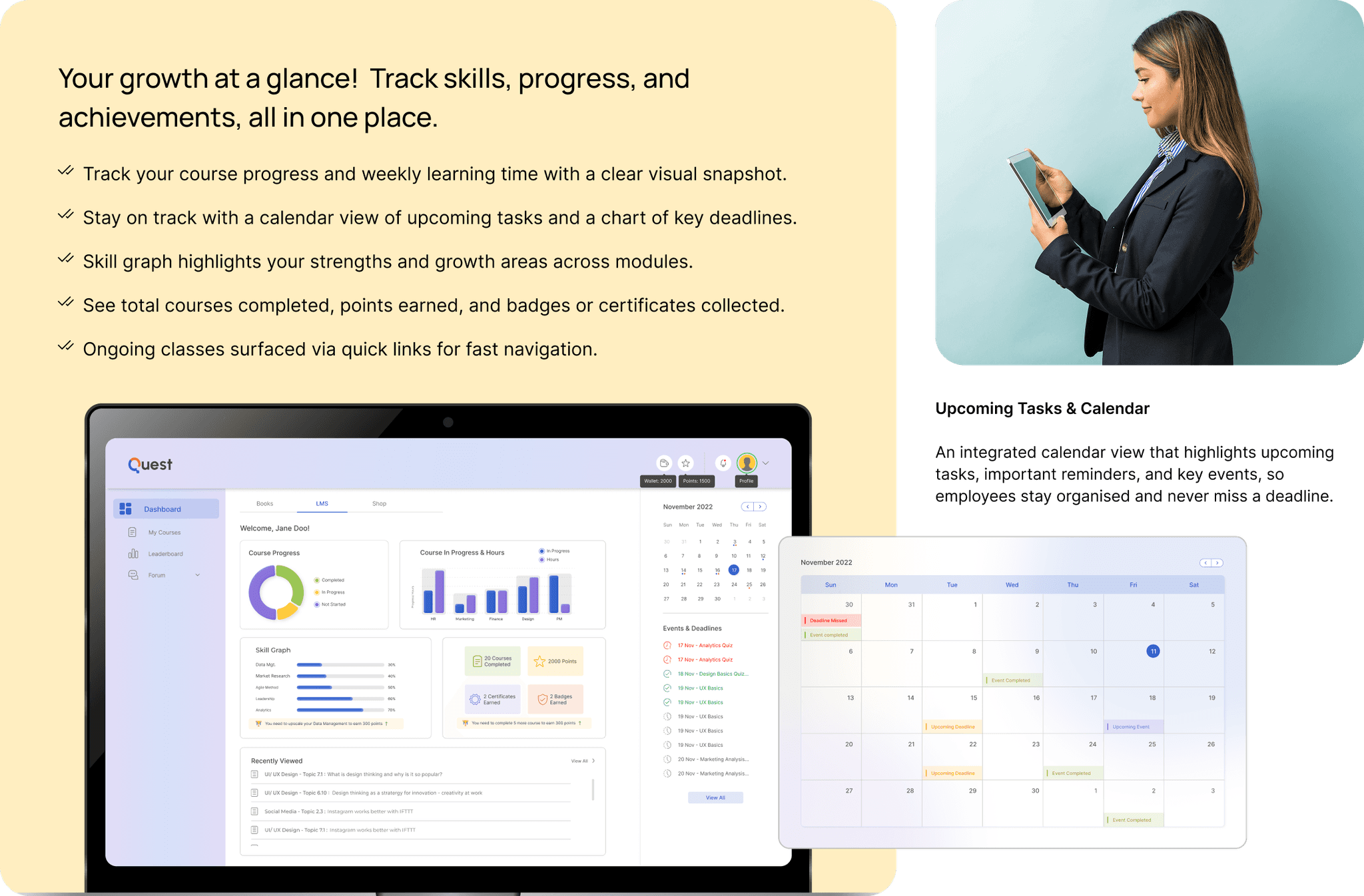
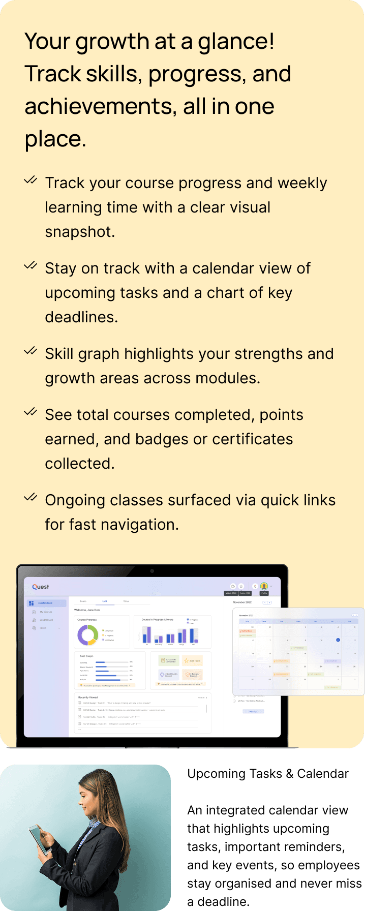
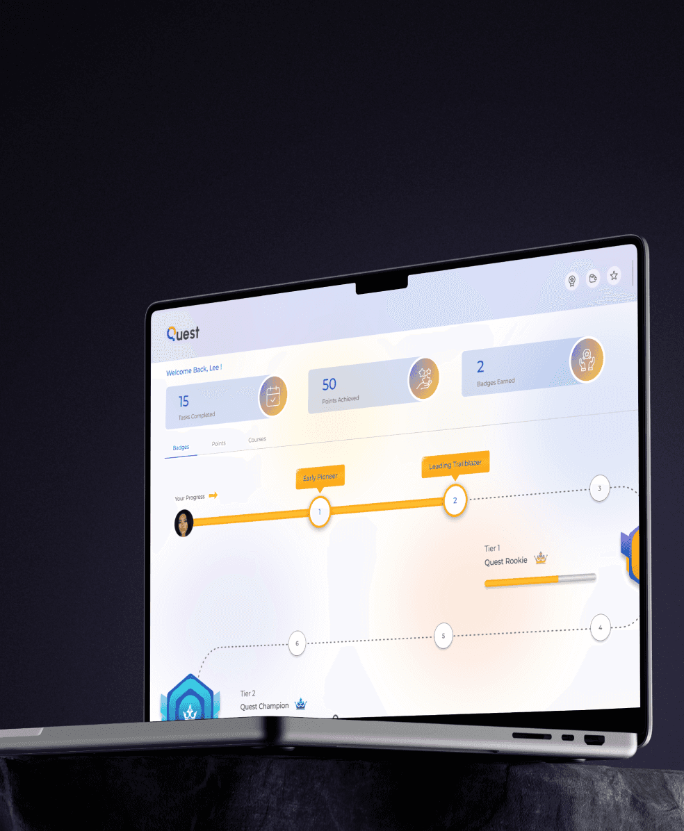
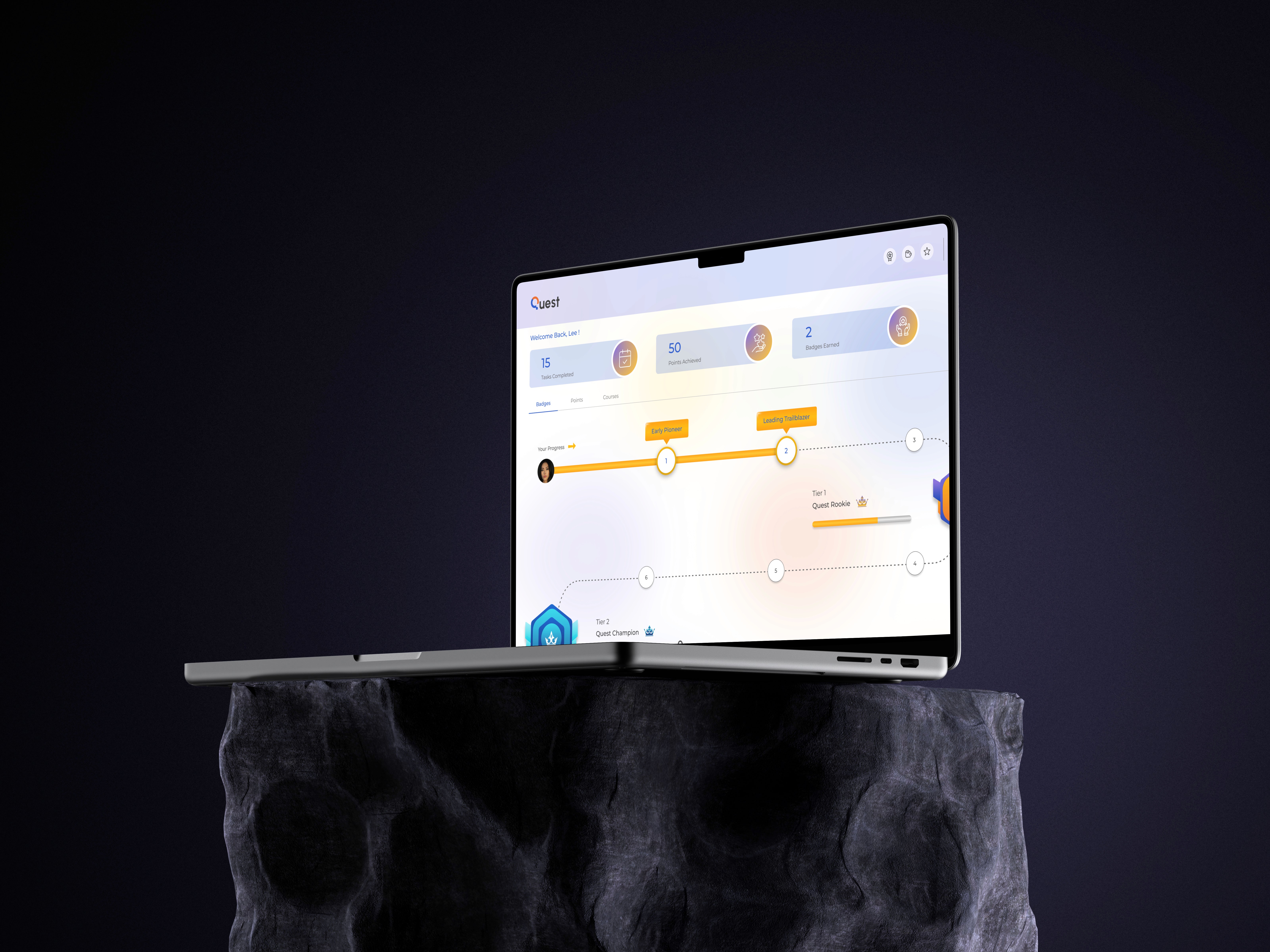
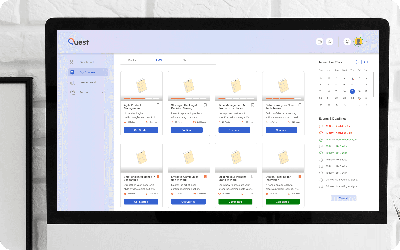
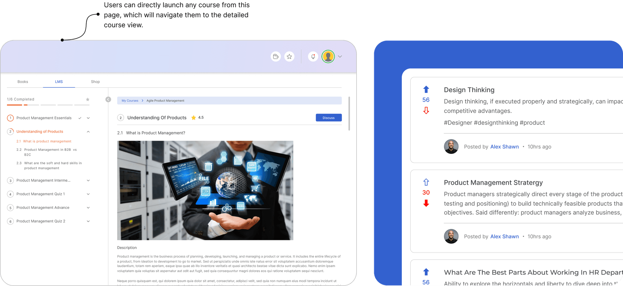
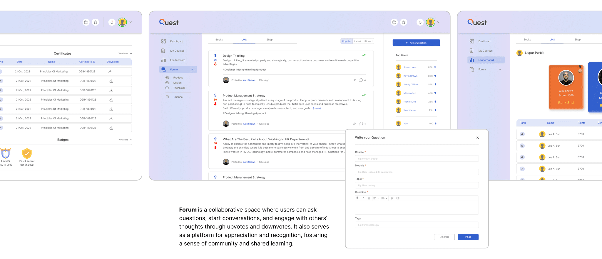
Employee LMS
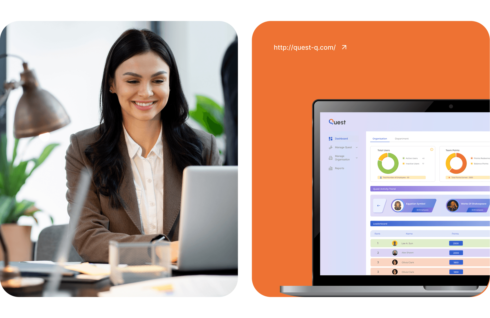
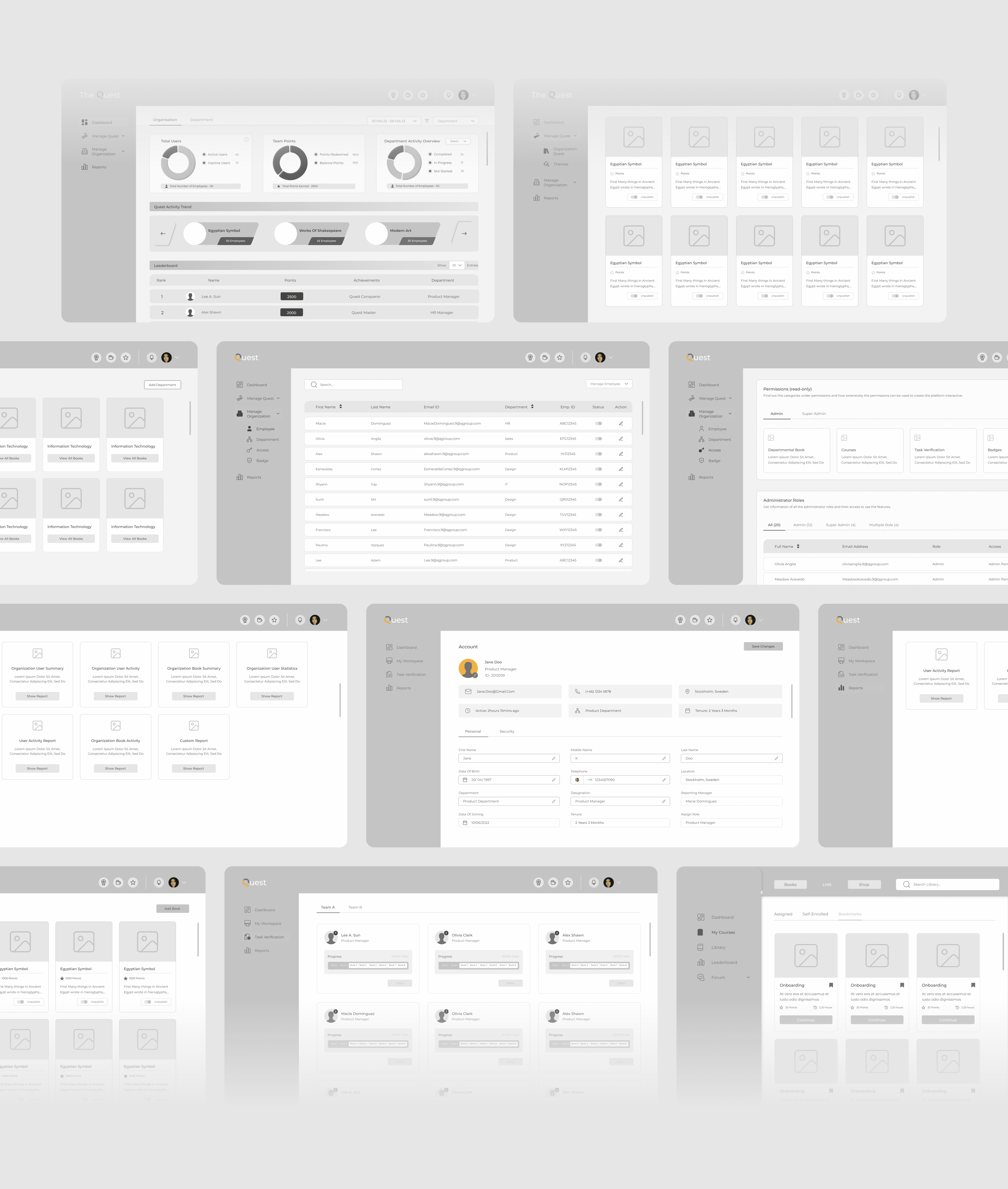
Super-admin Dashboard
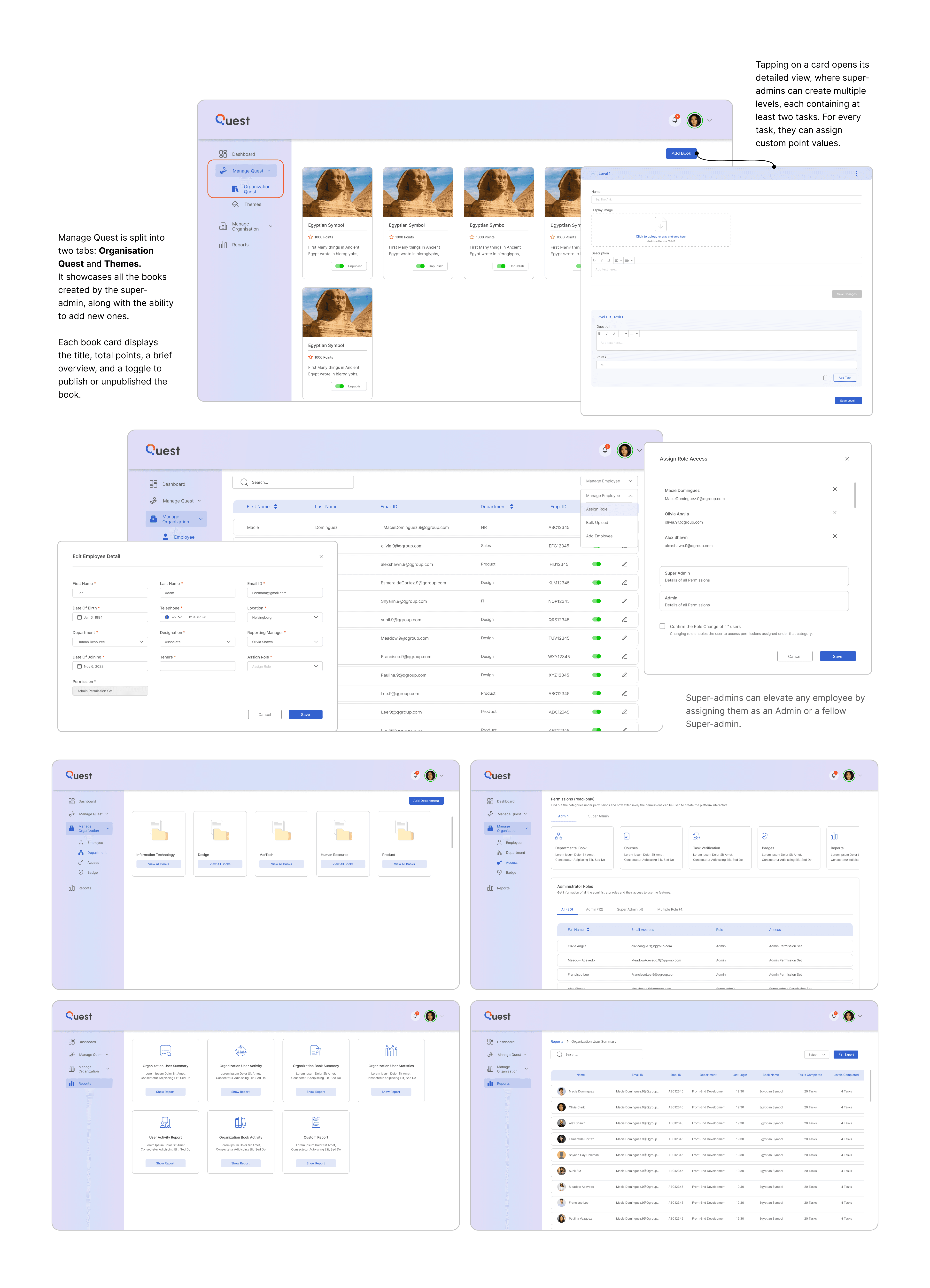
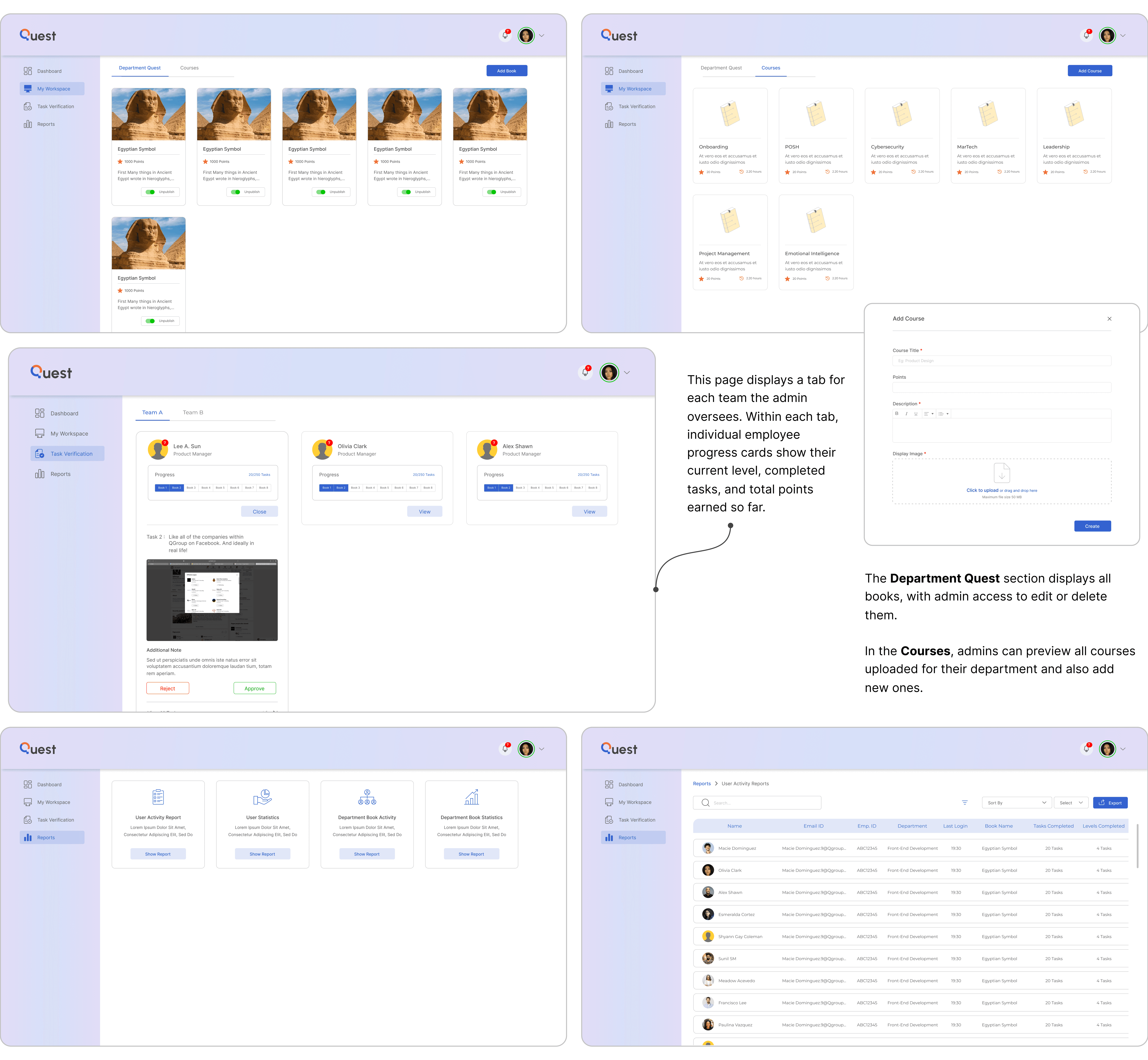
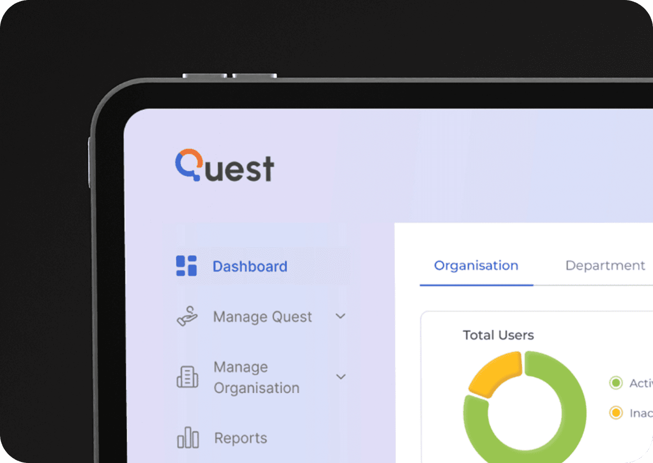
Super-admins have full access to design and oversee the engagement curriculum. Their view includes four key sections: Dashboard, Manage Quest, Organisation, and Reports.
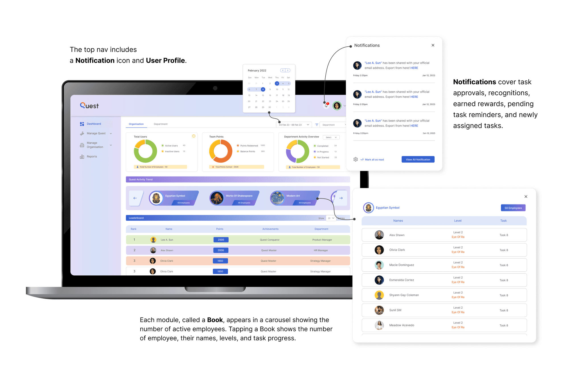
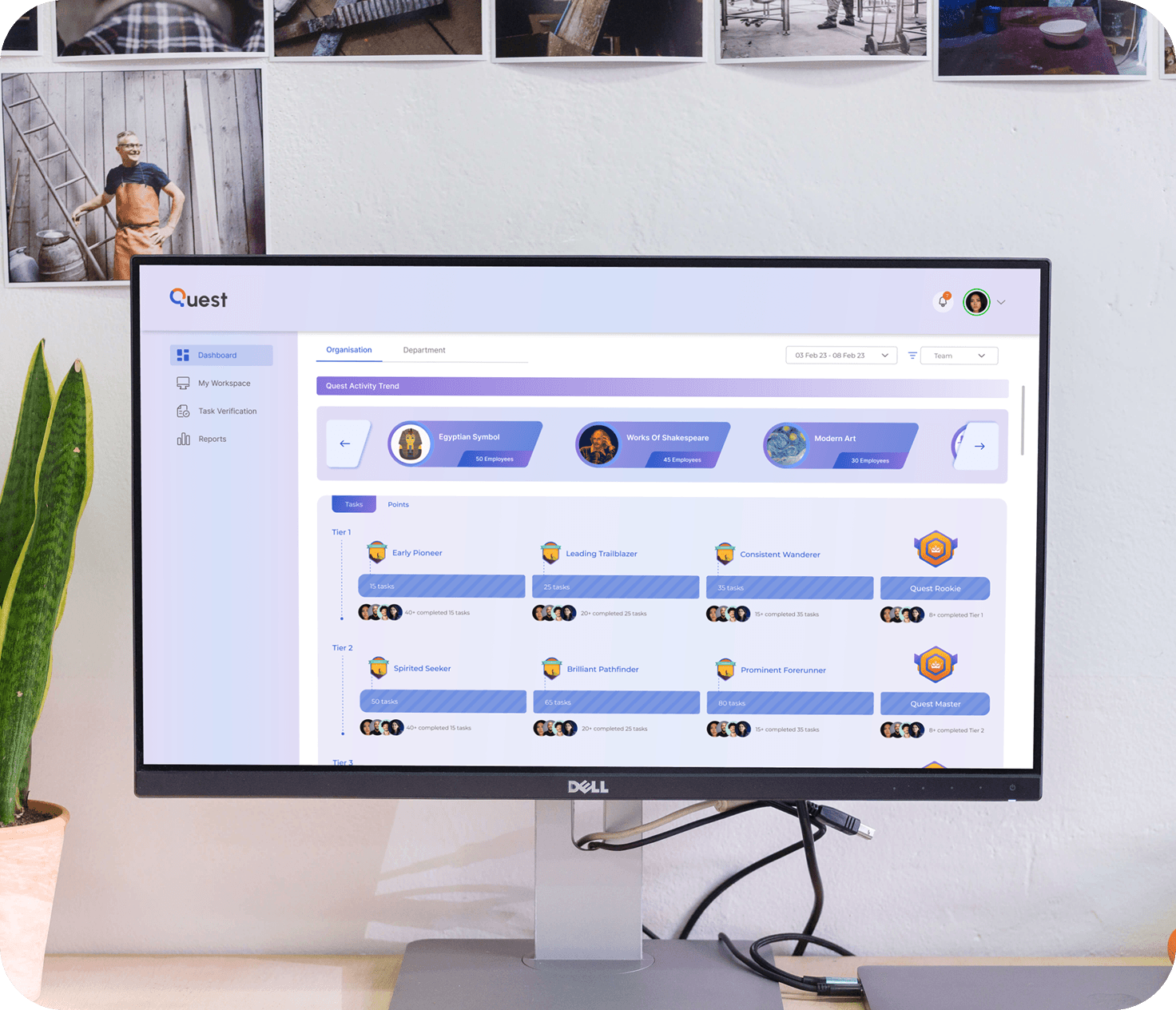
Admins can switch between teams using a dropdown to view stats for a selected duration. The dashboard includes a carousel of activity books with participation details, plus a progress overview showing each employee’s level, earned badges, and task status.
Quest Branding
Making Our Mark
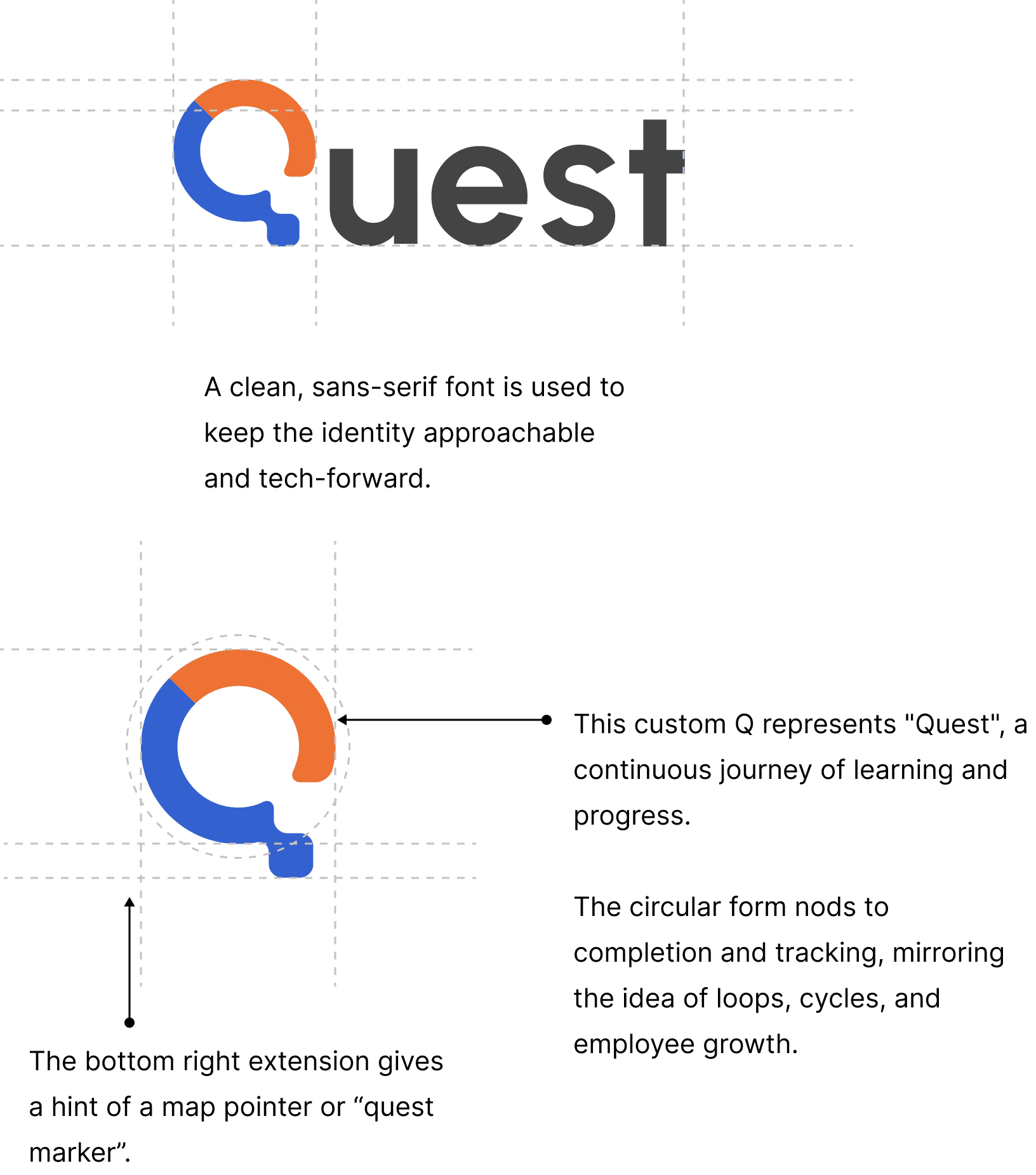
Quest logo is simple, bold, and smart just like the experience we aim to deliver. The standout “Q” isn’t just a letter; it’s a symbol. The circular form reflects progress and motion, while the subtle notch hints at direction and discovery a nod to each employee’s personal journey.
This mark works everywhere from internal dashboards to learning modules, always reminding users that The Quest is where growth begins.
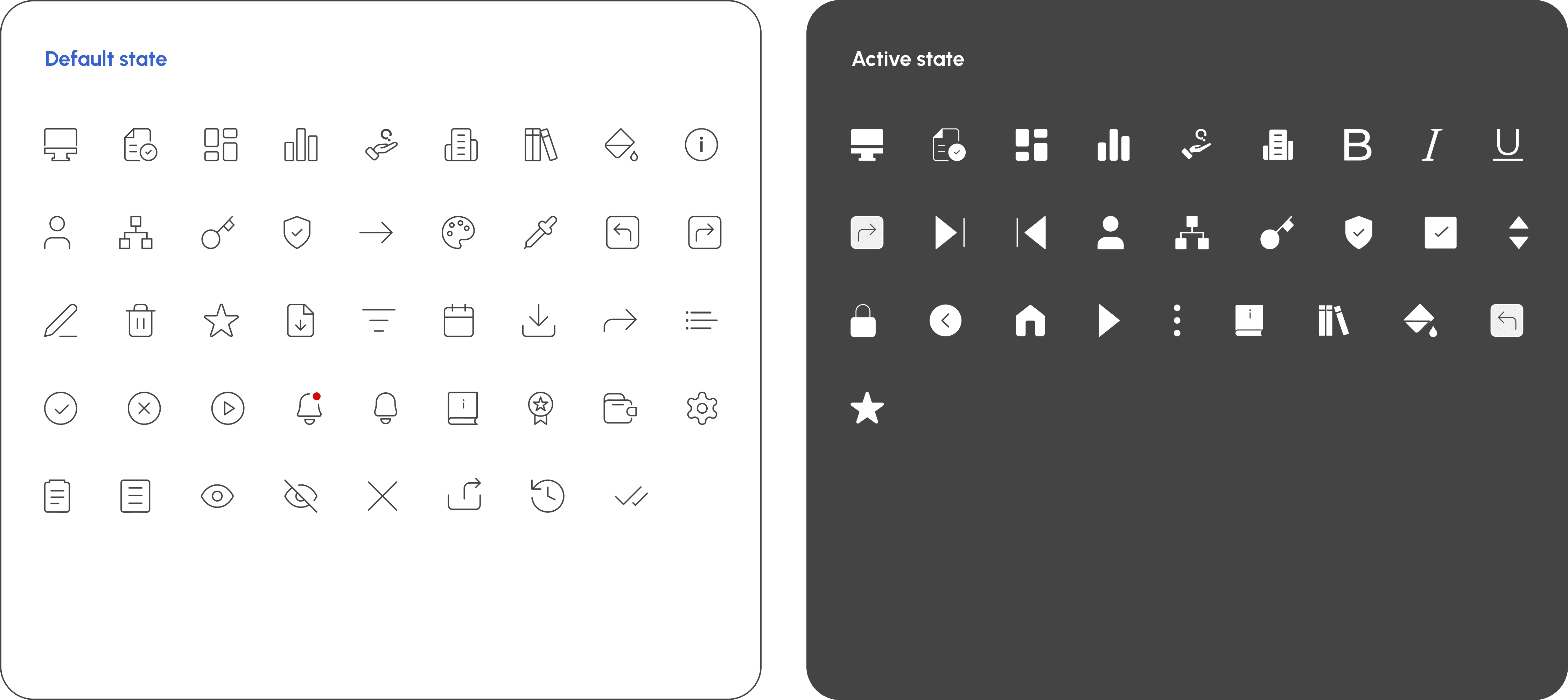
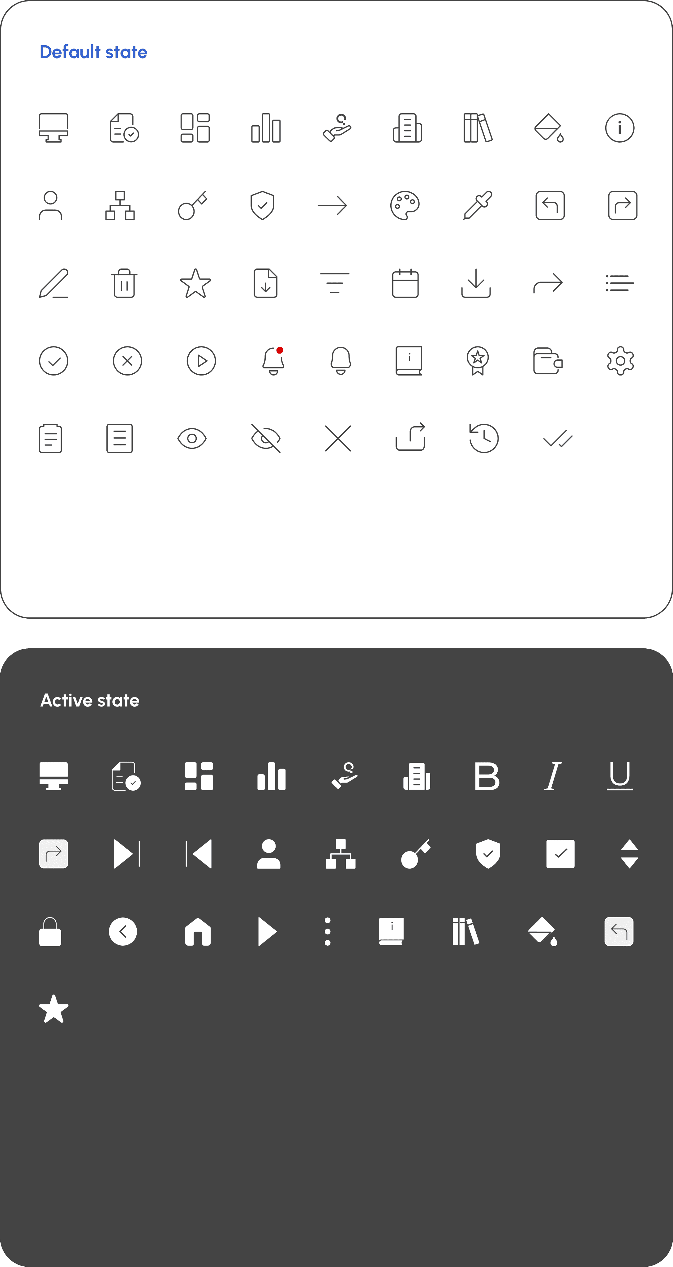
Iconography
Quest’s icon system is thoughtfully categorised by user role and interface context ranging from Super Admin to LMS. Each icon is available in distinct interaction states: Default and Hover/Click, ensuring clear visual feedback and intuitive navigation.